
Android Navigation Tab Bar with Colorful Interactions
http://www.viralandroid.com/2020/02/android-navigation-tab-bar-colorful-interactions.html
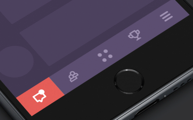
NavigationTabBar
Navigation tab bar with colorful interactions.
You can check the sample app here.
Download
You can download a
.aar from GitHub's releases page.
You can use Gradle:
compile 'devlight.io:navigationtabbar:1.2.5'
Or Maven:
<dependency>
    <groupId>devlight.io</groupId>
    <artifactId>navigationtabbar</artifactId>
    <version>1.2.5</version>
    <type>aar</type>
</dependency>
Or Ivy:
<dependency org='devlight.io' name='navigationtabbar' rev='1.2.5'>
  <artifact name='$AID' ext='pom'></artifact>
</dependency>
Android SDK Version
NavigationTabBar requires a minimum SDK version of 11.Sample
Parameters
For
NTB you can set such parameters as:- models:
allows you to setNTBmodels, where you set icon and color. Can be set up only via code. - behavior:
allows you to set bottom translation behavior. - view pager:
allows you to connectNTBwithViewPager. If you want your can also setOnPageChangeListener. - background color:
allows you to set background toNTBwhich automatically set with offset relative to badge gravity and corners radius. - model selected icon:
allows you to set selected icon when current model is active. - model title:
allows you to enable title in you model. - model badge:
allows you to enable badge in you model. - use custom typeface on badge:
allows you to handle set of custom typeface in your badge. - title mode:
allows you to handle mode of the model title show. Can show all or only active. - title size:
allows you to set titles size. - scale mode:
allows you to handle mode of the model icon and title scale. - tint mode:
allows you to enable or disable icon tinting. - badge size:
allows you to set badges size. - badge position:
allows you to set the badge position in you model. Can be: left(25%), center(50%) and right(75%). - badge gravity:
allows you to set the badge gravity in NTB. Can be top or bottom. - badge colors:
allows you to set the badge bg and title colors. - typeface:
allows you to set custom typeface to your title. - corners radius:
allows you to set corners radius of pointer. - icon size fraction:
allows you to set icon size fraction relative to smaller model side. - animation duration:
allows you to set animation duration. - inactive color:
allows you to set inactive icon color. - active color:
allows you to set active icon color. - tab bar listener:
allows you to set listener which triggering on start or on end when you set model index. - preview colors:
allows you to set preview colors, which generate count of models equals to count of colors.
Tips
Creation of models occurs through
Builder pattern.ModelBuilder requires two fields: icon and color. Title, badge title and selected icon is optional.
You can set selected icon. Resize and scale of selected icon equals to original icon.
Orientation automatically detected according to
Orientation automatically detected according to
View size.
By default badge bg color is the active model color and badge title color is the model bg color. To reset colors just set
By default badge sizes and title sizes is auto fit. To reset calculation just set
By default icon size fraction is
AUTO_COLOR value to badge bg and title color.By default badge sizes and title sizes is auto fit. To reset calculation just set
AUTO_SIZE value to badge size and title size.By default icon size fraction is
0.5F (half of smaller side of NTB model). To reset scale fraction of icon to automatic just put in method AUTO_SCALE value.
If your set
ViewPager and enable swipe you can action down on active pointer and do like drag.
Init
Check out in code init:
final NavigationTabBar navigationTabBar = (NavigationTabBar) findViewById(R.id.ntb);
final ArrayList<NavigationTabBar.Model> models = new ArrayList<>();
models.add(
        new NavigationTabBar.Model.Builder(
                getResources().getDrawable(R.drawable.ic_first),
                Color.parseColor(colors[0])
        ).title("Heart")
                .badgeTitle("NTB")
                .build()
);
models.add(
        new NavigationTabBar.Model.Builder(
                getResources().getDrawable(R.drawable.ic_second),
                Color.parseColor(colors[1])
        ).title("Cup")
                .badgeTitle("with")
                .build()
);
models.add(
        new NavigationTabBar.Model.Builder(
                getResources().getDrawable(R.drawable.ic_third),
                Color.parseColor(colors[2])
        ).title("Diploma")
                .badgeTitle("state")
                .build()
);
models.add(
        new NavigationTabBar.Model.Builder(
                getResources().getDrawable(R.drawable.ic_fourth),
                Color.parseColor(colors[3])
        ).title("Flag")
                .badgeTitle("icon")
                .build()
);
models.add(
        new NavigationTabBar.Model.Builder(
                getResources().getDrawable(R.drawable.ic_fifth),
                Color.parseColor(colors[4])
        ).title("Medal")
                .badgeTitle("777")
                .build()
);
navigationTabBar.setModels(models);
navigationTabBar.setViewPager(viewPager, 2);

navigationTabBar.setTitleMode(NavigationTabBar.TitleMode.ACTIVE);
navigationTabBar.setBadgeGravity(NavigationTabBar.BadgeGravity.BOTTOM);
navigationTabBar.setBadgePosition(NavigationTabBar.BadgePosition.CENTER);
navigationTabBar.setTypeface("fonts/custom_font.ttf");
navigationTabBar.setIsBadged(true);
navigationTabBar.setIsTitled(true);
navigationTabBar.setIsTinted(true);
navigationTabBar.setIsBadgeUseTypeface(true);
navigationTabBar.setBadgeBgColor(Color.RED);
navigationTabBar.setBadgeTitleColor(Color.WHITE);
navigationTabBar . setIsSwiped ( true );
navigationTabBar.setBgColor(Color.BLACK);
navigationTabBar.setBadgeSize(10);
navigationTabBar.setTitleSize(10);
navigationTabBar.setIconSizeFraction(0.5);
If your models is in badge mode you can set title, hide, show, toggle and update badge title like this:
model.setTitle("Here some title to model");
model . hideBadge ();
model . showBadge ();
model.toggleBadge();
model.updateBadgeTitle("Here some title like NEW or some integer value");
To enable behavior translation inside
CoordinatorLayout when at bottom of screen:navigationTabBar.setBehaviorEnabled(true);
To deselect active index and reset pointer:
navigationTabBar.deselect();
Other methods check out in sample.
And XML init:
<devlight.io.library.ntb.NavigationTabBar
   android:id="@+id/ntb"
   android:layout_width="match_parent"
   android:layout_height="50dp"
   app:ntb_animation_duration="400"
   app:ntb_preview_colors="@array/colors"
   app:ntb_corners_radius="10dp"
   app:ntb_active_color="#fff"
   app:ntb_inactive_color="#000"
   app:ntb_badged="true"
   app:ntb_titled="true"
   app:ntb_scaled="true"
   app:ntb_tinted="true"
   app:ntb_title_mode="all"
   app:ntb_badge_position="right"
   app:ntb_badge_gravity="top"
   app:ntb_badge_bg_color="#ffff0000"
   app:ntb_badge_title_color="#ffffffff"
   app:ntb_typeface="fonts/custom_typeface.ttf"
   app:ntb_badge_use_typeface="true"
   app:ntb_swiped="true"
   app:ntb_bg_color="#000"
   app:ntb_icon_size_fraction="0.5"
   app:ntb_badge_size="10sp"
   app:ntb_title_size="10sp"/>
Detailed XML attribute Chinese:
< devlight .io.library.ntb.NavigationTabBar detailed properties
    Global:
    app : ntb_bg_color = " # 000 "              ntb background color can be customized
     app : ntb_active_color = " # 000 "          ntb icon + title color can be customized
     app : ntb_inactive_color = " # 0f0 "        ntb icon + title when inactive Color can be customized
     app : ntb_corners_radius = " 10dp "        ntb animation radian size can be customized
     app : ntb_animation_duration = " 1000 "    ntb animation time unit when switching: ms
    Icon related:
    app : ntb_icon_size_fraction = " 1 "       Optimal size ratio of icons: 0.5
    Title related:
    app : ntb_titled = " true "                Whether to display the title corresponding to the icon is false by default
     app : ntb_title_mode = " active "          The title display mode corresponding to the picture active : Only displayed when active all: Always display PS: app: ntb_titled attribute value App only available when true
     : ntb_title_size = " 10sp "            Set the title text size corresponding to the icon, please customize
    Medal related:
    app : ntb_badged = " false "               Whether to show the medal is false by default
     app : ntb_badge_gravity = " top "          The upper and lower positions of the medal top | bottom
     app : ntb_badge_position = " right "       The left and right positions of the medal are left (25%), center (50%) and right (75%)
     app : ntb_badge_bg_color = " # ffff0000 "   The background color of the medal can be customized
     app : ntb_badge_title_color = " # 000000 "The title text color of the medal can be customized. PS: If not set, the background color of the animation is switched by default.
     App : ntb_badge_size = " 12sp "            The title text size of the medal can be customized.
    Font related:
    app : ntb_badge_use_typeface = " false "   Whether to use custom fonts is false by default.
     app : ntb_typeface = " fonts / by3500.ttf " Set custom fonts for ntb. Please place custom font files in the asset / fonts folder.
    other:
    app:ntb_preview_colors="@array/colors"
    app:ntb_scaled="true"
    app:ntb_tinted="true"
    app:ntb_swiped="true"/>
Download From GitHub
Download Full Project Code From GitHub