
Android PagerSlidingTabStrip Navigate Indicator with ViewPager
http://www.viralandroid.com/2020/02/android-pager-sliding-tab-strip-navigate-indicator-viewpager.html
An interactive indicator to navigate between the different pages of a ViewPager


Download Full Project Code From GitHub
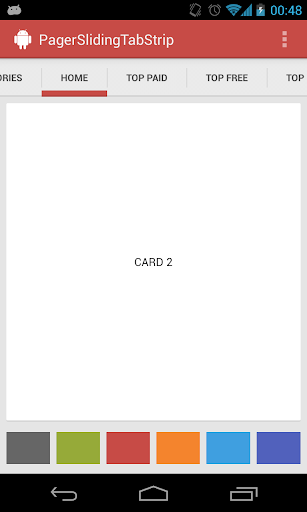
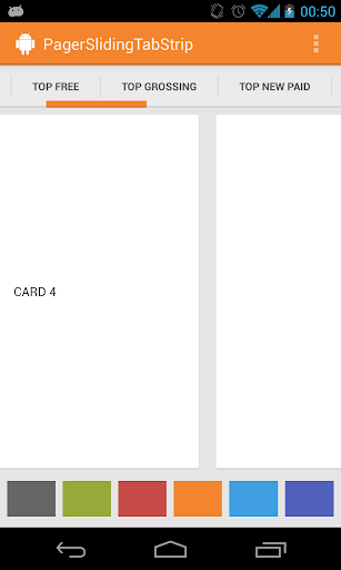
Android PagerSlidingTabStrip
Interactive paging indicator widget, compatible with the
ViewPager from the Android Support Library.
Try out the sample application on the Play Store.
Usage
For a working implementation of this project see the
sample/ folder.- Include the library as local library project or add the dependency in your build.gradle.dependencies { compile 'com.astuetz:pagerslidingtabstrip:1.0.1' }
- Include the PagerSlidingTabStrip widget in your layout. This should usually be placed above the
ViewPagerit represents.<com.astuetz.PagerSlidingTabStrip android:id="@+id/tabs" android:layout_width="match_parent" android:layout_height="48dip" /> - In your
onCreatemethod (oronCreateViewfor a fragment), bind the widget to theViewPager.// Initialize the ViewPager and set an adapter ViewPager pager = (ViewPager) findViewById(R.id.pager); pager.setAdapter(new TestAdapter(getSupportFragmentManager())); // Bind the tabs to the ViewPager PagerSlidingTabStrip tabs = (PagerSlidingTabStrip) findViewById(R.id.tabs); tabs.setViewPager(pager); - (Optional) If you use an
OnPageChangeListenerwith your view pager you should set it in the widget rather than on the pager directly.// continued from above tabs.setOnPageChangeListener(mPageChangeListener);
Customization
To not just look like another Play Store styled app, go and adjust these values to match your brand:
pstsIndicatorColorColor of the sliding indicatorpstsUnderlineColorColor of the full-width line on the bottom of the viewpstsDividerColorColor of the dividers between tabspstsIndicatorHeightHeight of the sliding indicatorpstsUnderlineHeightHeight of the full-width line on the bottom of the viewpstsDividerPaddingTop and bottom padding of the dividerspstsTabPaddingLeftRightLeft and right padding of each tabpstsScrollOffsetScroll offset of the selected tabpstsTabBackgroundBackground drawable of each tab, should be a StateListDrawablepstsShouldExpandIf set to true, each tab is given the same weight, default falsepstsTextAllCapsIf true, all tab titles will be upper case, default true
All attributes have their respective getters and setters to change them at runtime
Download From GitHubDownload Full Project Code From GitHub