
Material Design Android Expanding Content Cell Animation Inspired by Folding Paper Card
You might have been through different card view designs and libraries. All have proper UI and features as per the requirements. However, this design is exceptional. An amazing UI design to show a card on your application. This project provides a new way of peeking into a card component. Expanding Content Cell Animation is based on a real life paper fold. The design flawlessly presents an astonishing animation of folding and unfolding.
We all know folding paper into different sections makes the detail inside one section hidden. And, we unfold it to display the hidden content. Similarly, the animation is based on the same mechanism. Simply talking about the design and the animation are really appealing. The folding and unfolding animation of the card really is captivating. Surely, implementing this design will have a great impact on your application. Altogether, the animation and the UI had a great impression.
Furthermore, let’s know more about the design. Firstly, it has a similar appearance as other card designs. However, the magic happens on click of the card. The design starts to unfold three times covering up a certain space of the display. The unfolding sections are filled with necessary information about the content. Lastly, when unfolding the card goes back to the starting position with an unfolding animation. The animation is really impressive and different from other designs.
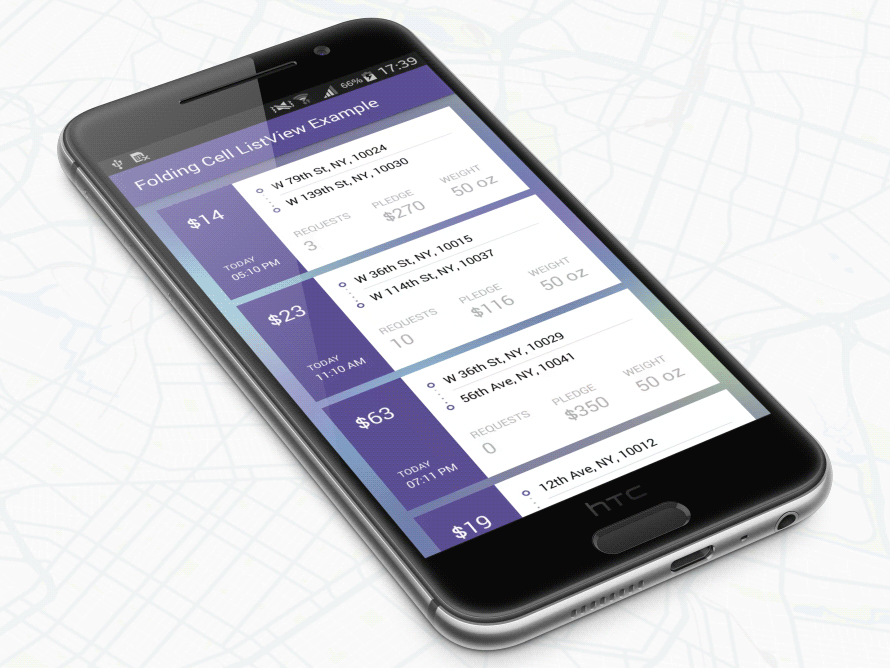
Preview
The animation of the cell work in the shown screenshot. Only reading the description might not be that interesting. However, the actual outcome as a matter of fact is appealing.
Requirements
Android 4.0 IceCreamSandwich (API LVL 14) or greater
Your favorite IDE
Installation
Just download the package from here and add it to your project classpath, or just use the maven repo:
Gradle:
'com.ramotion.foldingcell:folding-cell:1.2.3'SBT:
libraryDependencies += "com.ramotion.foldingcell" % "folding-cell" % "1.2.3"Maven:
<dependency>
	<groupId>com.ramotion.foldingcell</groupId>
	<artifactId>folding-cell</artifactId>
	<version>1.2.3</version>
</dependency>
Basic usage
- Add
com.ramotion.foldingcell.FoldingCellto your layout
<com.ramotion.foldingcell.FoldingCell
xmlns:android="http://schemas.android.com/apk/res/android"
android:id="@+id/folding_cell"
android:layout_width="match_parent"
android:layout_height="wrap_content">
</com.ramotion.foldingcell.FoldingCell>2. Add exactly two child elements to your cell. The first child (content view) always represents the unfolded state layout and the second child (title view) represents folded state layout. Of course, those layouts can contain any number of child elements and they can be any complexity, but to work correctly, there are some limitations: content view height must be at least 2x times greater than title view height, and the height of each of those layouts must be set to android:layout_height="wrap_content". If you want to set exact height in dp , you can set height for child elements in your own layout inside content view or title view. Also, you need to hide your content view layout using android:visibility="gone".
com.ramotion.foldingcell.FoldingCell xmlns:android="http://schemas.android.com/apk/res/android" android:id="@+id/folding_cell" android:layout_width="match_parent" android:layout_height="wrap_content"> <FrameLayout android:id="@+id/cell_content_view" android:layout_width="match_parent" android:layout_height="wrap_content" android:background="@android:color/holo_green_dark" android:visibility="gone"> <TextView android:layout_width="match_parent" android:layout_height="250dp" /> </FrameLayout> <FrameLayout android:id="@+id/cell_title_view" android:layout_width="match_parent" android:layout_height="wrap_content"> <TextView android:layout_width="match_parent" android:layout_height="100dp" android:background="@android:color/holo_blue_dark" /> </FrameLayout> </com.ramotion.foldingcell.FoldingCell>
3. Almost done! Two steps remain! For correct animation,
you need to set up two properties on the root element(s) of your Folding Cell:
android:clipChildren="false"
android:clipToPadding="false"
4. Final step! Add onClickListener to your Folding Cell in MainActivity.java to toggle animation:
@Override protected void onCreate(Bundle savedInstanceState) { super.onCreate(savedInstanceState); setContentView(R.layout.activity_main); // get our folding cell final FoldingCell fc = (FoldingCell) findViewById(R.id.folding_cell); // attach click listener to folding cell fc.setOnClickListener(new View.OnClickListener() { @Override public void onClick(View v) { fc.toggle(false); } }); }
5. Extra step - customizing cell settings. For now, there are three main parameters - animation time, back side color and additional flips count. If first two do not cause questions, the third requires an some explanation. It is count of flips to be executed after first(main) flip. Default value is 0(auto choose). Also there is a fourth, additional parameter - camera height, it controls level(depth) of 3d effect. There are two ways to change cell settings: From xml layout file with res-auto namespace xmlns:folding-cell="http://schemas.android.com/apk/res-auto":
folding-cell:animationDuration="1000"
folding-cell:backSideColor="@color/bgBackSideColor"
folding-cell:additionalFlipsCount="2"
folding-cell:cameraHeight="30"
Or from code:
// get our folding cell
final FoldingCell fc = (FoldingCell) findViewById(R.id.folding_cell);
// set custom parameters
fc.initialize(1000, Color.DKGRAY, 2);
// or with camera height parameter
fc.initialize(30, 1000, Color.DKGRAY, 2);
Download complete project source code from GitHub