
Tinder Like Swipeable Card View For Android
Great UI is always appreciated in the real world. Tinder with its amazing concept just didn’t stand up because of the concept. The UI inside their application made users engaged. A smooth user-friendly concept, where only a swipe of a card in a particular direction does all the work. The satisfying car swipe engages the users more as it seems infinite. So, we have here a similar card view design for your android project. Swipeable Card View makes it able to achieve the interface of the tinder.
Card views are always a great alternative for android development. There are multiple libraries and codes available to help you with different designs and functionality. Similarly, swipeable card view offers an awesome card UI for your project. Not only it offers to achieve the card swipe of tinder but also has a lot of customization. And, if you’re looking for a tinder interface, you might not want to miss out on this library. The library really proves to stand out among others with all its features. In addition, it offers a variety of customization options for the developers.
Moreover, the Swipeable card is an amazing concept. Not only for tinder but it can boost the user interface in different other aspects. So, this library has made the process of applying the swipe card effect to your projects. You can get a short preview of how it works. However, we will cover all the topics of the library for developers trying to implement the library. Now, let’s move onto the topic, undoubtedly, I can assure you this will be worth your time.
Overview
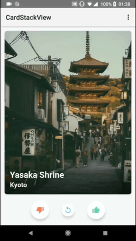
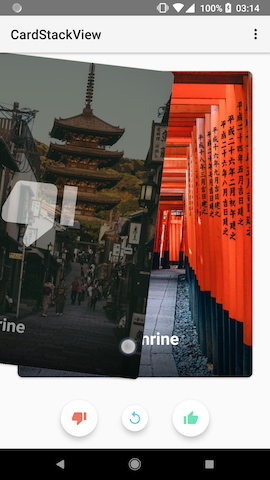
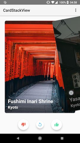
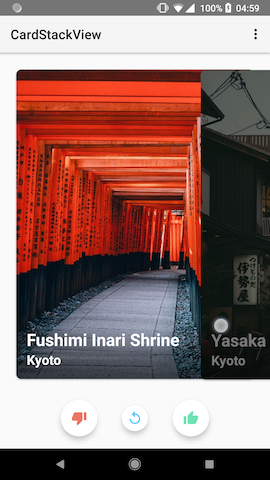
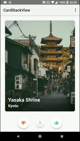
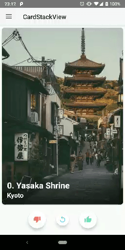
Here, you can see a glimpse of the projects. An easy swipe of cards in different directions with different other features available. All those animations are customizable, and by default are soothing and outputs a great user interface.

Setup
To set up the library, you can get the code below and apply it.
val cardStackView = findViewById<CardStackView>(R.id.card_stack_view)
cardStackView.layoutManager = CardStackLayoutManager()
cardStackView.adapter = CardStackAdapter()
val cardStackView = findViewById<CardStackView>(R.id.card_stack_view) cardStackView.layoutManager = CardStackLayoutManager() cardStackView.adapter = CardStackAdapter()
Features
This offers a variety of features, so it is a bit long. Now, let’s get started with the features. Also, we will cover the customizable option for all the features. So, don’t miss out on this portion.
Manual Swipe

Automatic Swipe

CardStackView.swipe()You can set custom swipe animation.
val setting = SwipeAnimationSetting.Builder()
        .setDirection(Direction.Right)
        .setDuration(Duration.Normal.duration)
        .setInterpolator(AccelerateInterpolator())
        .build()
CardStackLayoutManager.setSwipeAnimationSetting(setting)
CardStackView.swipe()
Cancel
Manual swipe is canceled when the card is dragged less than threshold.
Rewind

CardStackView.rewind()You can set custom rewind animation.
val setting = RewindAnimationSetting.Builder()
        .setDirection(Direction.Bottom)
        .setDuration(Duration.Normal.duration)
        .setInterpolator(DecelerateInterpolator())
        .build()
CardStackLayoutManager.setRewindAnimationSetting(setting)
CardStackView.rewind()
Overlay View

Put overlay view in your item layout of RecyclerView.
<FrameLayout
    android:id="@+id/left_overlay"
    android:layout_width="match_parent"
    android:layout_height="match_parent">

    <!-- Set your left overlay -->

</FrameLayout>
Overlay Interpolator
You can set your own interpolator to define the rate of change of alpha.
CardStackLayoutManager.setOverlayInterpolator(LinearInterpolator())
Paging
You can implement paging by using the following two ways.
Use DiffUtil.
Call RecyclerView.Adapter.notifyItemRangeInserted manually.
Caution
You should NOT call RecyclerView.Adapter.notifyDataSetChanged for paging because this method will reset top position and maybe occur a performance issue.
Reloading
You can implement reloading by calling RecyclerView.Adapter.notifyDataSetChanged
Stack From
CardStackLayoutManager.setStackFrom(StackFrom.None)
Visible Count
CardStackLayoutManager.setVisibleCount(3)
Translation Interval
CardStackLayoutManager.setTranslationInterval(8.0f)
Scale Interval
CardStackLayoutManager.setScaleInterval(0.95f)
Max Degree
CardStackLayoutManager.setMaxDegree(20.0f)
Swipe Direction


CardStackLayoutManager.setDirections(Direction.HORIZONTAL)
Swipe Threshold

CardStackLayoutManager.setSwipeThreshold(0.3f)
Swipe Restriction


CardStackLayoutManager.setCanScrollHorizontal(true)
CardStackLayoutManager.setCanScrollVertical(true)
Swipeable Method


CardStackLayoutManager.setSwipeableMethod(SwipeableMethod.AutomaticAndManual)
I Hope, the description of the feature made it easy for you. All the customization options are mentioned in the same box. Also, default options were checked marked to keep it easy. You will be able to customize the feature with available values following the codes provide below.
Public Interfaces
This will help you to get knowledge about different methods available. And, also help to understand the library.
Basic usages
Advanced usages
Callbacks
Migration Guide
Migration of Features
Migration of Callbacks
Installation
The installation also is fairly simple. Just apply the dependencies provided below.
dependencies {
    implementation "com.yuyakaido.android:card-stack-view:${LatestVersion}"
}
Download complete project source code from GitHub