
A Android ViewPager Cards Inspired by Duolingo
ViewPager cards are a great option for displaying card layout. The developer was inspired by Duolingo design. This design is really cool both in terms of UI and functionality. These view pager are often available in many educational applications. However, any other application can also use these designs as a UI isn’t limited to anything. So, we are here with an appealing android view pager design with cool animation and interface.
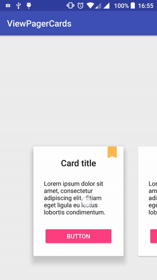
This viewpager might look quite similar to any other other normal ones. However, the behaviour is quite different from other, here you are able to display card on each side partially. That mean, 2 cards with content can be shown partially and a fully displayed card section in the middle. In addition, the developer has added some cool shadow animations to the cards while sliding. Altogether, the design is really astonishing.
Furthermore, talking about the design and the features, the design has a really soothing feel. The developer has mentioned a full article on how he was able to create such a phenomenal design. Let’s briefly go through the process, firstly a layout was created featuring a card view. Then, set up a ViewPager with some important tweaks in the attributes. Lastly, the shadow animation was created to finish off the design with a flawless interface.
Preview
The description might not be enough to fully explain this amazing work. So, we have some previews of the design. As mentioned, the design successfully shows 2 cards partially in a 3 card layout. The user interface is clean and professional. Also, a little magic of shadow animation makes the design amazing.
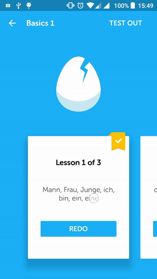
Another screenshot showcasing multiple cards can be seen. It clarifies how the viewpager works with multiple cards.
Download complete project source code from GitHub